


02City Monitor: the latest data
There is considerable variation in the economic performance of cities across the UK. The purpose of this chapter is to show the scale and nature of this variation by highlighting the performance of cities on 18 indicators covering:
- Population
- Business dynamics
- Productivity
- Innovation
- Employment
- Skills
- Wages
- Inequality
- Housing
- Environment
- Digital connectivity
For most indicators the 10 strongest and 10 weakest performing cities are presented. Interactive charts, maps and tables of the full list of cities can be found using the data tool
Figure 14: Cities as a share of the national average

Population
Growing populations can give an indication of the economic opportunity that is available in cities. Cities that provide more job and career opportunities are likely to retain and attract more people.
- In 2015, 53.8 per cent of the UK population (around 35 million) lived in cities.
- The four biggest cities (London, Birmingham, Manchester and Glasgow) accounted for almost a quarter of the total UK population (24.3 per cent) and 45 per cent of the total population living in cities.
- London alone was home to 15.2 per cent of the UK population and accounted for 28.1 per cent of the population living in cities.
- 28 out of 63 cities experienced a higher population growth than the national average between 2014 and 2015. Among the top 10 fastestgrowing
cities, eight were located in the south of England. - On the other hand, nine of the 10 slowest-growing cities were located in Northern England and in Scotland. Birkenhead and Blackpool were the
only two cities that did not record population growth between 2014 and 2015. In Birkenhead the population remained stable, while it decreased by 0.3 per cent in Blackpool.
Table 1: Population growth
Business Dynamics
City economies are predominantly driven by their businesses. The overall number of businesses in a city, as well as the number of new business startups and closures, are all good indicators of the strength of a city’s economy.
Business starts and closures
- More than three out of five businesses (62 per cent) that started up in 2015 were located in cities. This has increased in recent years: in 2014, 61 per cent of business starts were in cities, while this was 58 per cent in 2010.
- Between 2014 and 2015 the number of business start-ups increased by 9.3 per cent in the UK. 52 out of 63 cities had more start-ups in 2015 than in 2014. Crawley, Slough and Doncaster recorded the highest increases in business start-ups with 29, 35 and 42 per cent growth respectively.
- Meanwhile, in 2015, 59 per cent of UK business closures occurred in cities.
- The number of business closures increased by 2.1 per cent nationally, with Edinburgh, Aberdeen and Northampton experiencing the highest increases in closures (11.9, 19.9 and 40.9 per cent respectively). However almost half of the cities (31 out of 63) had fewer closures in 2015 than in 2014, with Ipswich (-13.3 per cent), Sunderland (-16.5 per cent) and Mansfield (-18.1 per cent) seeing the largest fall.
- London had the highest number of start-ups per 10,000 population in 2015 (112.4), followed by Northampton (100.4) and Slough (86.5). At the other end of the spectrum Belfast (32.6), Dundee (32.4) and Sunderland (30.7) were the lowest ranked cities.
- London and Northampton were also the two cities with the highest number of closures (64.2 and 54.2).
- Doncaster, Slough and Northampton had the highest churn rate (14.1, 11.9 and 11.5) – these cities saw the greatest difference between new businesses setting up and current businesses closing.
Table 2: Business starts and closures per 10,000 population
Business stock
- Cities were home to 54 per cent of all UK businesses in 2015. Between 2014 and 2015 the stock of businesses increased by 5 per cent in the UK, and by 6 per cent in cities as a whole. Looking at the past 10 years, business stock increased by almost a quarter nationally, and by a third in cities.
- Doncaster was the city with the fastest year on year growth in business stock (17.2 per cent between 2014 and 2015) followed by Slough (12.5 per cent). Over the last five years Slough has been the strongest performer, seeing growth of 42 per cent.
- London alone accounted for 23 per cent of the total UK business stock, far larger than Manchester and Birmingham (both accounting for 3 per cent of the total business stock).
- London also ranked first for business stock per capita, with 552 businesses per 10,000 population, followed by Reading (464), Milton Keynes (448) and Brighton (447).
- Dundee (220), Plymouth (217) and Sunderland (200) had the lowest levels of business stock per 10,000 population in 2015.
Figure 3 Business stock per 10,000 population

Productivity and Innovation
Productivity and innovation are drivers of long-run economic growth. Finding new and better ways of making goods and delivering services improves the performance of businesses, which in turn increases the productivity of city economies.
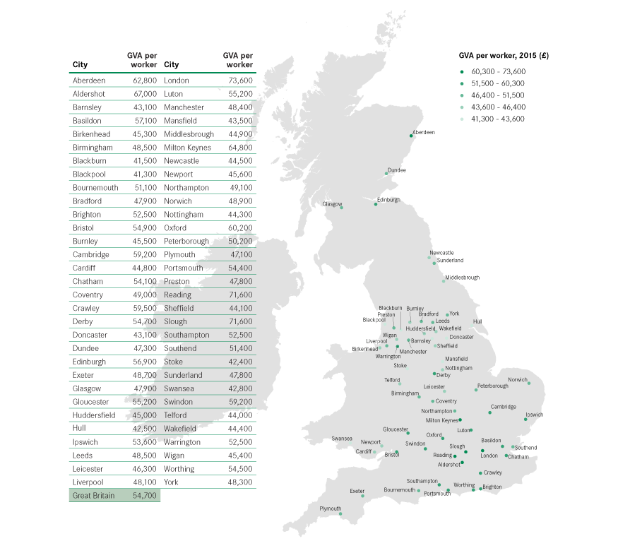
Productivity
- Only 15 cities out of 62 had levels of productivity above the British average in 2015. This is two cities fewer than in 2014.
- London, Slough and Reading were the three cities with the highest levels of productivity, with GVA per worker over 30 per cent above the British average of £54,700.
- Between 2014 and 2015 productivity increased in 48 out of 62 cities, with Luton recording the highest growth in GVA per worker (8.6 per cent), followed by York (5.7 per cent) and Swindon (5.4 per cent).
- In contrast, Middlesbrough, Stoke and Northampton experienced the largest fall in productivity, falling by at least 2 per cent.
Table 4: GVA per worker
Figure 15: GVA per worker
UK patent applications
- In total, about 12,000 patent applications from the UK were published in 2015. Of this, 59 per cent of all patent applications published were registered in cities in 2015.
- Cambridge had the highest number of patent applications published per 100,000 residents in 2015 (341). This was almost three times more than Coventry, the second city (118.4 applications published per 100,000 residents).
- London had the highest absolute number of patent applications published in 2015, with 2,105 publications. Relative to its resident-base the capital ranked 20th nationwide, with 21 applications published per 100,000 residents.
- Seven of the top 10 cities with the highest number of published patent applications are located in the South of England, with the exceptions of Coventry, Derby and Aberdeen.
Box 4: Measuring innovation
Patent data is widely used to measure innovation. Patents are registered with the Intellectual Property Office and have an address allocated to them making it possible to assign them to a particular city.
However, we note that using patent data is an imperfect measure of innovation. There is no way to verify that the innovative activity happened at the address on that application.
Patents also only demonstrate more technical innovations and exclude process innovations, trademarks and creative innovation, much of which takes place within service sector businesses.
However, while patents do not cover all forms of innovation, they do act as a good proxy, and there is large variation across the country.
Table 5: Patent applications published
Employment
High employment rates, employment growth and low unemployment point to well-functioning labour markets, where demand for workers among employers is high. Low employment rates and high unemployment suggest weaker employer demand and potentially lower skills available locally.
Employment rate
- 43 out of 63 cities across the UK improved their employment rate in 2016, and 17 did so by two or more percentage points.
- Overall, UK employment increased by 0.8 percentage points between 2015 and 2016, from 72.9 per cent to 73.7 per cent. The cities’ average remains slightly lower than the national average, at 71.9 per cent.
- 29 cities had employment rates below the national average. To bring these cities up to the current UK average a further 549,200 residents would need to find employment.
- Dundee, the UK city with the lowest employment rate in 2016 (63.5 per cent), would need almost 9,800 of its residents to find employment to reach the UK average. Birmingham (the city with the highest deficit in absolute terms) would need 146,100 of its residents to find jobs to match the UK average.
- Southern cities tend to perform better than cities elsewhere. Warrington and Northampton were the only cities outside the South of England to feature in the top 10.
- Big cities tend to fare worse than the average, with only three (Bristol, Portsmouth and London) of the 12 biggest cities having employment rates above the national average.
Table 6: Employment rate
Claimant count
- Almost two thirds (64 per cent) of those claiming unemployment benefit lived in cities in 2016.
- Between 2014 and 2015, 27 out of 63 UK cities experienced a reduction in their share of working age population claiming unemployment benefit.
- However in most cities (48 out of 63), the variation in the number of persons claiming unemployment benefit was below 10 per cent.
Private sector jobs growth
- 49 of 62 cities increased their level of private sector employment between 2014 and 2015, and 21 did so by more than the British average (2.5 per cent).
- 13 cities saw reductions in their private sector employment, and in five cities, it dropped by more than 2 per cent (Aberdeen -5.4 per cent, Barnsley -4.3 per cent, Worthing -3.6 per cent, York -3.1 per cent and Blackburn -2.6 per cent).
Public and private sector jobs
- In 2015 the private to public sector employment ratio in Great Britain was 2.8.
- Of 62 cities, only 19 had private to public employment ratios above the British average.
- Crawley, Slough and Swindon had the highest ratios, recording respectively 7.2, 4.3 and 4.3 private sector jobs for every publicly-funded position.
- In the bottom 10 cities, Oxford had almost the same number of private and public sector employees, mainly as a result of its universities. This highlights that higher levels of publicly-funded jobs do not necessarily mean a less successful economy.
Table 7: Claimant count
Table 8: Private sector jobs growth
Table 9: Ratio of private sector to publicly-funded jobs
Skills
Skills levels are critical to the success of a city economy. Those cities that have a high proportion of graduates tend to have stronger economies than those that have a large number of people with no formal qualifications.
High level qualifications
- While cities were home to 55.5 per cent of the UK working age population in 2015, they were home to 57.3 per cent of those with a degree or equivalent qualification.
- 15 cities out of 63 had a higher share of high-skilled population than the country average.
- The UK’s highly skilled population is concentrated in a few cities. The top 10 cities combined accounted for almost 30 per cent of the total UK highly skilled population (and 22 per cent of the working age population), whereas the bottom 10 only accounted for 2.6 per cent of the population with high level qualifications (but 4 per cent of the working age population).
- Northern cities fare poorly on this measure. Six of the top 10 cities with the highest proportion of graduates are located in the South, while only two southern cities (Southend and Ipswich) are in the bottom 10.
- Scottish cities perform relatively well when compared with the rest of the UK, with Edinburgh, Aberdeen and Glasgow ranking in the top 10 and Dundee in 14th position.
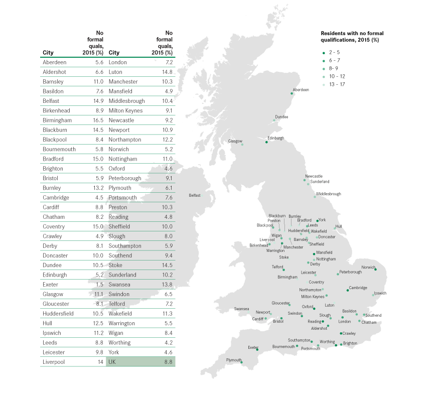
No formal qualifications
- Cities were also over represented for people with no qualifications, being home to almost 59 per cent of the population with no formal qualifications.
- More than half of the cities (33 of the 63) had a higher share of population with no formal qualification than the national average in 2015.
- Most of the best performing UK cities were small or medium sized, while three of the UK’s 12 biggest cities – Liverpool, Birmingham and Bradford – were in the bottom 10.
- Some cities have very polarised skills profiles: Glasgow had the 5th highest share of working age population with high level qualifications (47.2 per cent), but also a very high share of population with no formal qualifications (11.1 per cent). Similarly, Belfast was 22nd in the UK for highly skilled population (34.9 per cent), but had the fourth highest share of population with no formal qualifications (14.9 per cent).
Table 10: Residents with high level qualifications
Table 11: Residents with no formal qualifications
Figure 16: Residents with no formal qualifications
Wages
Wages reflect the types of jobs available in cities. Those cities that have higher workplace wages typically have a greater number of high skilled jobs in them than those that have lower wages.
- In 2016, the average weekly workplace wage in cities was equal to £560, compared to the UK average of £525.
- However in only 18 cities did workers earn more than the UK average. The average London weekly wage was £697, this was 70 per cent higher than in Southend (£405).
- Compared to 2015, real weekly earnings increased by 2.7 per cent, or £14, in the UK overall (from £511 to £525). Despite this, 17 cities saw their
weekly salaries decrease in real terms between 2015 and 2016. Slough recorded the largest fall (-£50 per week) but still had one of the highest average salaries (£588 in 2016 prices). Interestingly other high wage cities are in the bottom of the rank for real weekly wage growth, including Oxford (-£13), Aberdeen (-£26) and Aldershot (-£31). - Southampton experienced the largest increase in wages, with a real growth of £57 per week between 2015 and 2016, followed by Newcastle (+£49), Milton Keynes (+£46), Burnley (+£40) and Ipswich (+£31).
Table 12: Average workplace wages
Inequality
As the UK economy has recovered from the last recession, there has been an increasing focus not just on achieving growth but ensuring this is ‘inclusive’ growth. This has become ever more prescient in light of the EU Referendum vote.
Experimental data on incomes of residents in England and Wales (which includes wages, pensions, benefits and other income) released by the ONS
using administrative data sources, allows us to create a Gini coefficient for each city to measure what inequality looks like across our cities. The Gini coefficient gives a value between zero and one, with zero representing perfect equality and one representing a very unequal society. The estimates for cities show that:
- The most equal cities tended to be in the North of England or Wales. Burnley, Stoke and Mansfield were the most equal of all English and Welsh cities.
- The top 10 least equal cities were dominated by those in the Greater South East, with Cardiff and York being the only two exceptions. Cambridge was the least equal, followed by Oxford and London.
- Those cities that were most equal also tended to have weaker economies, for example having lower average incomes and fewer knowledge-based services jobs. This means that although these cities were more equal, they were poorer overall.
- Just 10 cities were more unequal than the English and Welsh average. This is likely to reflect the greater preference of higher income people to live in the hinterland around cities, rather than in cities themselves.
Table 13: Gini coefficient
Housing
Housing stocks and prices together provide useful insights into cities’ housing markets, highlighting both supply and demand measures and their impact on house affordability.
Housing stock growth
- The UK’s dwelling stock increased by 0.7 per cent between 2014 and 2015, consistent with previous years (0.6 per cent between 2013 and 2014).
- In 26 cities housing stock growth exceeded the UK average, with Peterborough experiencing the highest growth (1.7 per cent), followed by Telford (1.5 per cent) and Cambridge (1.4 per cent).
- About 30,000 net new dwellings were built in London between 2014 and 2015. This represented a housing stock growth of 0.8 per cent, ranking London 21st nationally.
House prices
- 13 out of 62 cities saw average house prices decrease between 2015 and 2016.
- While house prices grew by an average 3.2 per cent in Great Britain, half of the cities (31) experienced higher growth in house prices.
- In 2016 Basildon experienced the highest house price growth, with average prices increasing by 15.1 per cent, followed by Luton (13.5 per cent) and Bristol (10.6 per cent).
- House prices in London (£561,400) were more than twice the British average (£267,800) and the highest of all cities. Oxford and Cambridge were second and third with £491,900 and £475,800, considerably above third-placed Reading (£375,200).
- At the other end of the spectrum, Burnley had the lowest average house price with £102,600, however it rose by 2.7 per cent compared to last year. The prices in Burnley were 5.4 times lower than in London, and 2.7 times lower than the British average.
- The cities that recorded a decrease in house price were located in Northern England and in Scotland.
Table 14: Housing stock growth
Table 15: House price growth
Housing affordability
- In 2016, house prices in Britain were 10 times the annual salary of residents.
- Oxford was the least affordable city, with house prices being 16.7 times higher than annual earnings, on a par with London. In total, only 14 out of 62 cities were less affordable than the British average.
- Burnley was the most affordable city, with an affordability ratio of 4.1.
- All the top 10 least affordable cities were located in the South of England. The majority of the most affordable locations were in the North West and Yorkshire regions.
Table 16: Housing affordability ratio
Environment
Accounting for over 80 per cent of total greenhouse gas emissions, CO2 emissions are one way to gauge how ‘green’ a city is, and the size of its carbon footprint.
- In 2014, cities accounted for 54 per cent of the UK population but only 46 per cent of the UK’s total CO2 emissions.
- Average UK emissions per capita in 2014 totalled 6.3 tonnes (down from 6.9 tonnes in 2013), but the city average was as low as 5.4 tonnes
- Swansea and Middlesbrough are significant outliers and they were two of only eight cities to emit more CO2 per capita than the national average. This was driven by large industrial installations – most likely their steel plants – which accounted for more than three quarters of total emissions in each city.
- Every single city except Swansea reduced their emissions level per capita in the year between 2013 and 2014.
- Big cities are significant emitters, but they are very efficient when emissions are considered on a per capita basis. London for example accounted for 10.6 per cent of total UK emissions in 2014, but was 15th out of 63 cities for per capita emissions with only 4.4 tonnes emitted for every resident (down from 5.1 tonnes in the previous year).
Table 17: Total CO2 emissions per capita
Digital connectivity
Broadband connection is a key component of the infrastructure offer that a city can make to businesses and entrepreneurs. The development of optical fibre has considerably increased broadband speeds across the country, now allowing more places to access ‘superfast’ (above 30 Mbps) and ‘ultrafast’ (above 100 Mbps) connections.
- In 2016, half of UK properties (51.4 per cent) were covered by ultrafast broadband.
- 55 out of 63 cities had more than half of their properties covered by ultrafast broadband.
- Among the top 10 cities, eight were located in the south of England, with the Derby (East Midlands) and Dundee (Scotland) the exceptions.
- In the bottom 10 cities, only two cities were in the south of England (Southend and Milton Keynes). However six of the bottom 10 cities still had high superfast coverage (above 30 Mbps), covering more than 90 per cent of properties.