
03A public expenditure map of Britain
This section sets out what the geography of public expenditure looks like across Britain.
Nationally
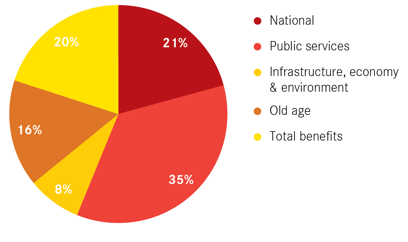
Around four-fifths of the £681 billion of public spend in Britain 2013/14 was determined by local characteristics. As Figure 6 sets out, public services was the largest contributor to this, and accounted for over one-third of the total spend. Benefits spending accounted for 20 per cent of the total, while old age benefits accounted for 16 per cent.
Figure 6: Composition of total British public expenditure, 2013/14
Box 3: Categorisation of public expenditure
Overall spending has been split into 5 broad categories:
- National spend includes all spending for the national good, such as defence and prisons.
- Public services includes all public services, such as health, education, bin collections and leisure services.
- Infrastructure, economy and environment includes house building, transport infrastructure and environmental protection.
- Old age includes spending on things like pensions and winter fuel allowance payments.
- Benefits spend includes benefits such as unemployment, disability and housing benefit.
Local authority basis
Figure 7 maps out the total estimated amount of public expenditure in local authorities, and Figure 8 maps the amount of spend per resident.
Figure 7: Total Government expenditure in local authorities, 2013/14
See the full map here.
Figure 8: Total Government expenditure in local authorities per resident, 2013/14
See the full map here.
Once again, large urban authorities dominate when looking at total spend, reflecting the large number of people that live in these authorities. At £11.7 billion, Birmingham had the highest spend, followed by Glasgow (£8.1 billion) and Leeds (£8 billion). In total, urban authorities accounted for 55 per cent of all expenditure.
Looking at the data on a per capita basis, which accounts for the differing size of populations, shows that Scottish authorities and coastal areas tend to have the highest levels of spend, while those in the Greater South East tend to have the lowest.
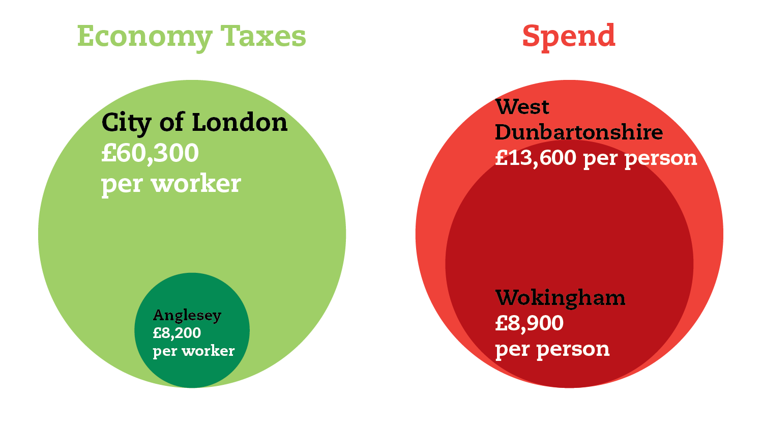
That said, the difference between local authorities is much smaller than for economy taxes raised per worker. The spend in the local authority with the lowest spend per head was 65 per cent of that with the highest. By way of comparison, when looking at tax per worker, the lowest generating authority raised just 14 per cent of that raised in the highest generating authority. This is no great surprise – a large bulk of spending is determined on a per capita basis. The result is that spending on public services takes up the largest proportion of spend in all authorities.
Figure 9: Differences between the local authorities with the lowest and highest levels of economy taxes raised per worker and spend per capita
There are two main explanations for this difference. The first is differences in the Barnett formula, which gives a greater amount of funding per capita to Scottish (and to a lesser extent Welsh) authorities than those in England. The result is that nine of the top 10 local authorities for public expenditure per head are in Scotland.
The second is old age and other benefits spending. For example, the high spend per population in Tendring in Essex is driven by its older demographic, while the high benefits spend in Blackpool and Liverpool, and specifically housing benefit in Brent and Hackney, pushes up spend per capita in these authorities. Oxford and Cambridge, meanwhile, have some of the lowest overall spend per capita because of their smaller pension age populations and lower benefit spends.
Cities have higher expenditure per capita than non-city areas, but the differences are small. Urban dwellers received around £11,100 per head in 2013/14 compared to £10,800 in the rest of Britain. This was driven by higher benefits spend in cities, while old age spend was much higher in non-city areas.
Political geographies
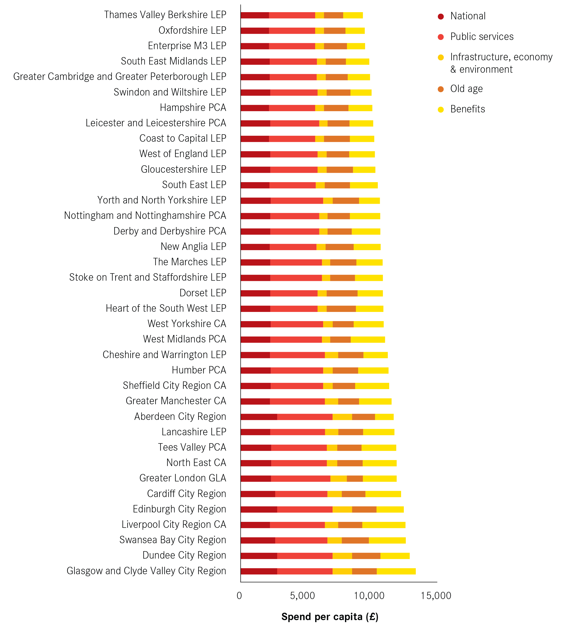
As with tax spending, given current devolution discussions it is useful to look at how combined authorities and LEPs compare for spending. As Figure 10 shows, at just under £100 billion, Greater London had the highest public expenditure in 2013/14, and was as large as the next three largest spenders combined.
Figure 10: Total Government expenditure in combined authorities and LEPs, 2013/14

But when looking on a per capita basis (Figure 11), Greater London had the seventh highest spend. Glasgow and the Clyde Valley came out with the highest (£13,100 per person), followed by the Dundee, Swansea and Liverpool city-regions. In Dundee, high levels of old age benefits spending was the main reason for its high overall spend, while in the other three benefits spend was the main driver.
Meanwhile, 11 of the 12 areas with the lowest spend were all in the South of England. Thames Valley Berkshire had the lowest spend per head at £9,100, reflecting both its low levels of old age and benefits spending.
Figure 11: Total Government expenditure in combined authorities and LEPs per resident, 2013/14
Summary
- While public expenditure is most commonly discussed in terms of departmental budgets and total national spend, the majority of spending is determined by local characteristics – be that the total number of people that live in a place, the total number of pensioners that live there or the strength of the local economy, which has a large impact on benefits spending.
- There is much less variation in spending than in tax raising. As well as differences in the allocation of the Barnett formula, the variation seen is driven by benefit and old age spend.
- Urban authorities tend to have higher levels of benefit spend, while other areas tend to have higher levels of old age spend.
- Public services account for the largest share of spending, accounting for between 29 per cent of 41 per cent of all spending in local authorities.